Ati Robotics Design System
The reference for visual and verbal identity across the Ati Robotics website and all related deliverables. Pull from these tokens, components, and conventions to keep every touchpoint consistent.
Identity & Voice
Ati Robotics is an enterprise-grade industrial robotics brand. The voice is confident, specific, and direct. Authoritative without academic; accessible without dumbing things down.
Brand Name
Always render the company name as Ati Robotics in mixed case. Never use "ATI" in all caps.
Correct: Ati Robotics, Ati Copilot, Ati Fleet Manager, Sherpa 10K
Wrong: ATI Robotics, ATI, ATI ROBOTICS
Headline Capitalization
Every headline uses AP/Chicago title case.
Correct: "Where the World Builds Vehicles. We Keep the Parts Moving."
Wrong: "Where the world builds vehicles. We keep the parts moving."
Anchor Text
Use descriptive anchor text that names the destination.
Correct: "Explore Automotive," "Fleet Manager details," "Tire plant site assessment"
Avoid: "Learn More," "Click here," "Read more"
Logo
Two versions of the Ati Robotics wordmark. Use the dark version on light backgrounds and the light version on dark backgrounds. Maintain clear space and minimum sizing for legibility.
Wordmarks


Files
| Variant | Filename | Use |
|---|---|---|
| For light backgrounds | Ati-Robotics-Light-version-02.png | Dark-colored wordmark. Use on White, Apple Grey, and other light surfaces. Default header state once user scrolls past the hero. |
| For dark backgrounds | Ati-Robotics-dark-version-02.png | Light-colored wordmark. Use on Ink, dark hero overlays, and dark imagery. Default header state above the fold. |
dark-version / Light-version) refers to the background the wordmark is designed for, not the color of the wordmark itself. The dark-version file contains the light-colored marks for use on dark surfaces.
Usage Rules
- Clear space — preserve at least the height of the wordmark's "A" on every side. No text, lines, or other elements should encroach.
- Minimum size — 120px wide for digital, 1 inch wide for print. Below this the wordmark loses legibility.
- Color — use the supplied dark or light PNG. Do not recolor, gradient-fill, or apply effects.
- Backgrounds — only use the wordmark on solid backgrounds with sufficient contrast, or over photography with a dark overlay.
- Lock-up — do not pair with other marks, taglines, or product names unless approved. The "Ati Robotics" wordmark stands alone.
info@atimotors.com). Do not introduce new "Ati Motors" branding in new deliverables — use "Ati Robotics" everywhere except where the legacy email is referenced.
Color Palette
Tokenized via CSS variables in main.css. Use semantic names (e.g., var(--ink)), not hex values, when extending the site.
Core Palette
Neutrals
Type System
DM Sans for everything visible. DM Mono for technical labels, eyebrows, and code. Both via Google Fonts. Weights used: 300, 400, 500, 600, 700, 900.
Type Scale
clamp() for fluid sizing. On the live site, hero H1 scales from 40px on mobile up to 64px on wide desktop. Section H2 scales 32-52px. Refer to main.css for exact responsive values.
Iconography
Stroke-style line icons in the Lucide visual family. 2px stroke, rounded line caps and joins, inheriting currentColor so they recolor with their parent context.
Style Specifications
| Property | Value | Rationale |
|---|---|---|
| Stroke width | 2px | Heavy enough to read at small sizes, light enough to feel modern. |
| Stroke linecap | round | Softer feel, brand-aligned with Apple-style aesthetic. |
| Stroke linejoin | round | Smooth corners on all icon paths. |
| Fill | none | Outline-style; lets the background show through. |
| ViewBox | 0 0 24 24 | Standard Lucide/Heroicons grid. |
| Color | currentColor | Inherits text color, so icons match surrounding type automatically. |
| Size | 16-24px typical | Inline next to text. Larger sizes for hero/feature use. |
| aria-hidden | "true" | For decorative icons. Always pair functional icons with accessible labels. |
Examples
Pattern Reference
Form Elements
All site forms use Netlify Forms with inline thank-you states. Labels live above inputs, never as placeholders alone. UTM hidden inputs sit at the bottom of every form.
src/static/landing-page-forms.md in the repository for the full Netlify Forms pattern, including UTM tracking and inline thank-you state implementation.
Cards & Stat Strips
Card grids and stat strips repeat across most page templates. Standard sizes shown below.
Stat Strip
Card Grid
Kitted Parts Delivery
Sequenced kits delivered from supermarket to assembly station on takt time — triggered by schedule or sensor.
Pallet Transport
Stamped parts, body panels, and sub-assemblies move between press shop, body shop, and paint on autonomous routes.
Dock-to-Floor Movement
Inbound materials travel from receiving dock to point of use autonomously — eliminating manual trips.
Spacing & Layout
Fluid section gaps, fixed container widths. All values scale at the standard breakpoints.
| Token | Default | ≤ 900px | ≤ 768px | Use |
|---|---|---|---|---|
--container-max | 1200px | 1200px | 1200px | Page content maximum width |
--container-pad | 64px | 40px | 24px | Horizontal padding inside containers |
--section-gap | 110px | 80px | 64px | Vertical gap between page sections |
Standard Breakpoints
| Breakpoint | Target | Behavior |
|---|---|---|
| 1024px | Mobile nav, tablet landscape | Mobile nav activates. Major grid collapses (5→3, 4→2, 3→2). |
| 900px | Tablet portrait | Section gap and container padding shrink. |
| 640px | Wide phone | 3-col grids collapse to 1-col. CTA pairs stack. |
| 480px | Phone portrait | Final single-column collapse. |
Photography Direction
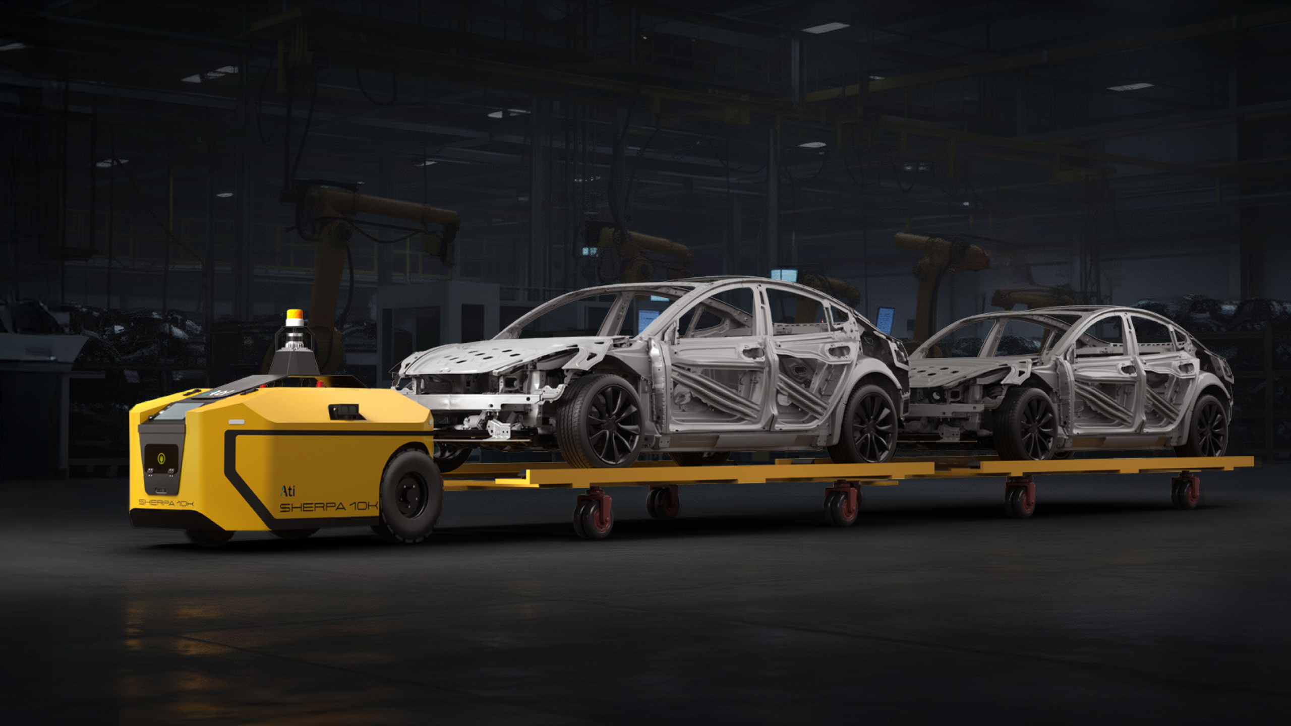
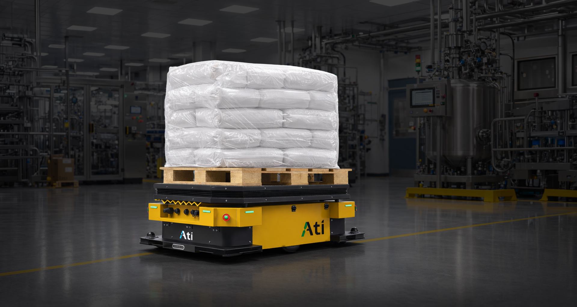
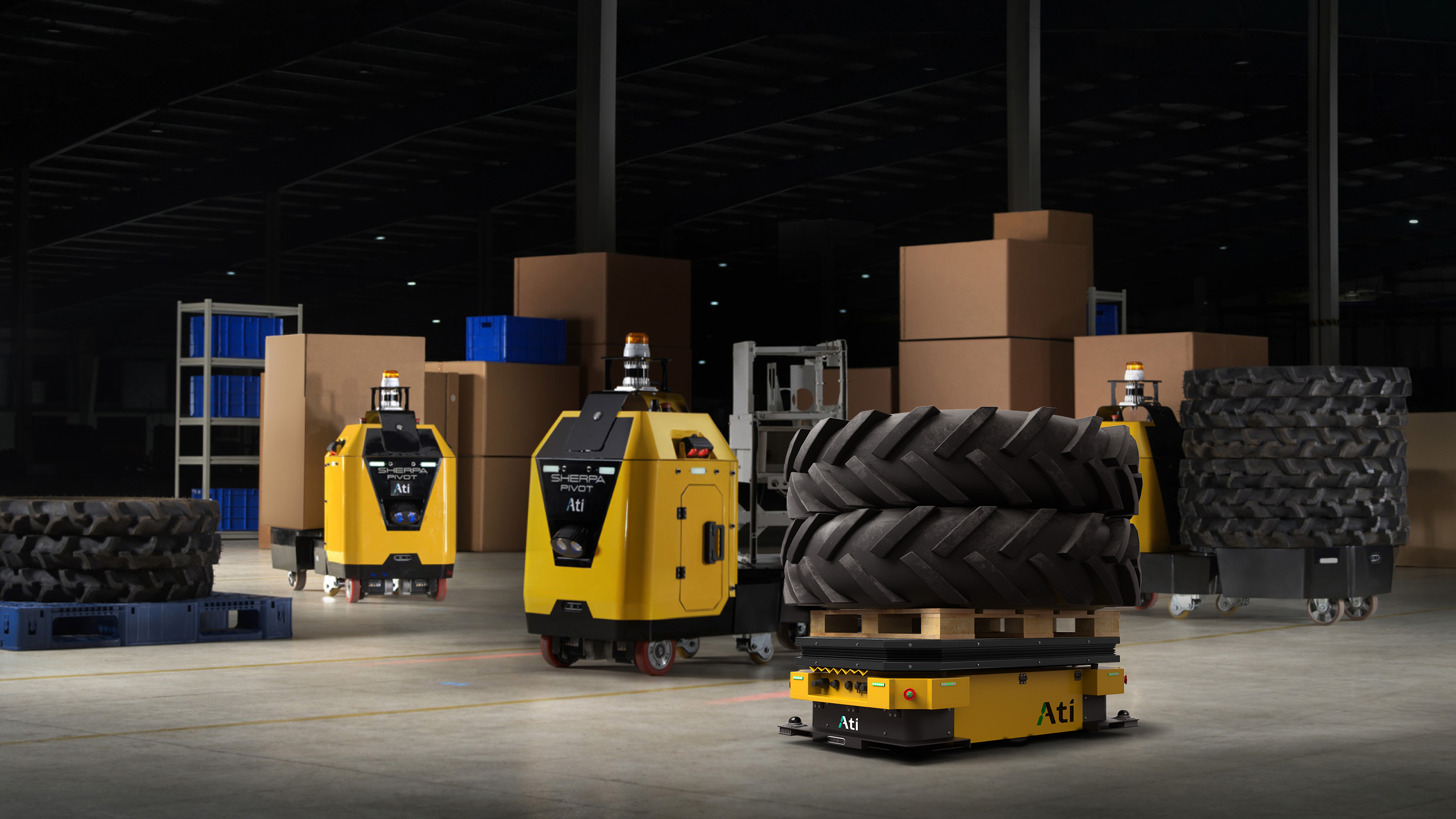
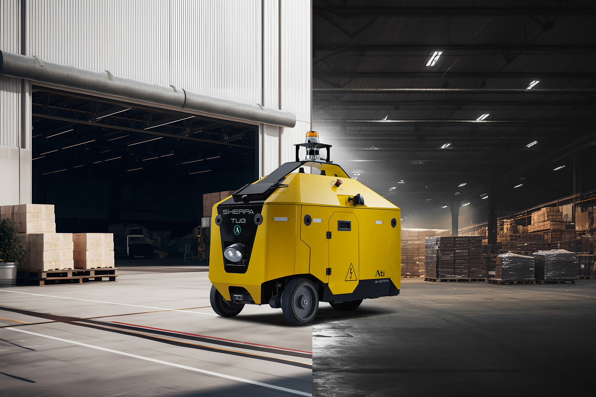
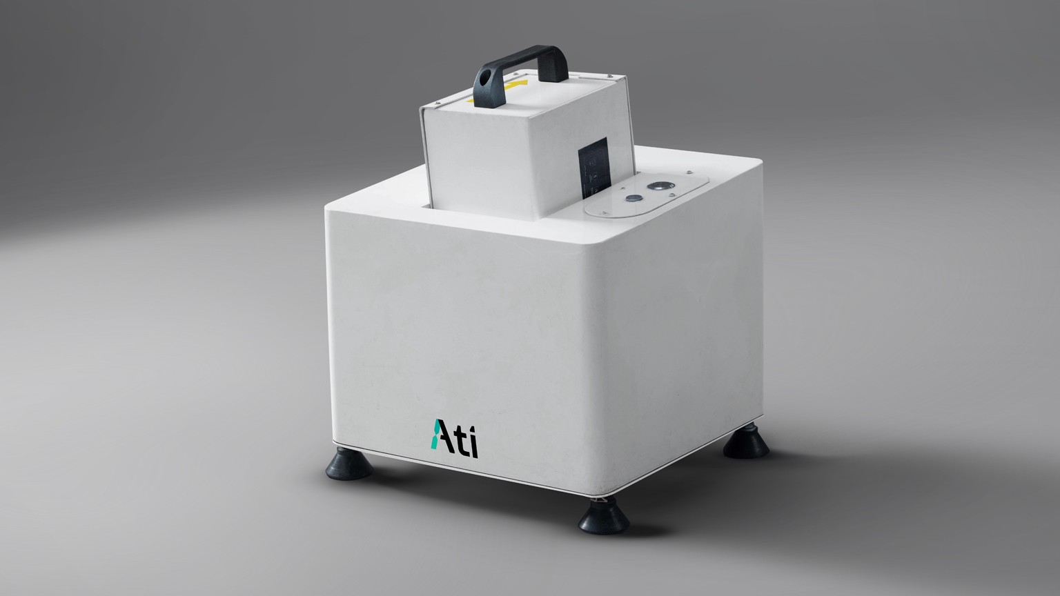
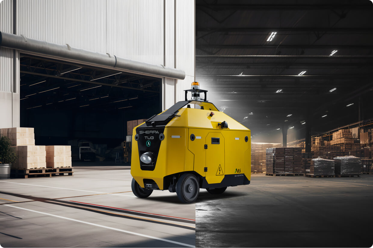
Industrial, documentary, on-the-ground in real factories. Show robots doing real work in real environments. Avoid renders, simulations, or stock photography.
Examples — Industry Photography
Examples — Product Photography
Direction
- Authentic environments — shoot in real factories, real warehouses, real industrial settings. No staged sets or studio backdrops.
- Robot in context — show the AMR doing the actual work (towing trolleys, lifting pallets, navigating aisles) rather than glamour shots in isolation.
- Atmospheric lighting — industrial natural light, warm overhead facility lights, slight haze. Avoid harsh flash, oversaturated color grading, or HDR effects.
- Color palette — earthy industrial tones (grays, concrete, machine yellow, brand teal accents). Photography should feel honest, not retouched.
- Composition — wide landscape orientation for hero/full-bleed. Leave breathing room on one side for text overlay (typically left side).
- People when present — operators or engineers shown as context, not as subjects. Avoid identifiable faces unless the person is a named team member (e.g., leadership headshots).
- Avoid — 3D renders, simulations, "futuristic" sci-fi imagery, stock photography of generic robots, conveyor-belt clichés, AI-generated images.
Specs by Use Case
| Use Case | Dimensions | Format | Max Size | Notes |
|---|---|---|---|---|
| Hero / Full-bleed | 2400 × 1350 px | JPG / WebP | 500 KB | 16:9 landscape. Compressed for web. |
| Section background | 1920 × 1080 px | JPG / WebP | 400 KB | Often rendered at 18% opacity behind text overlay. |
| Product photography | 1200 × 800 px+ | JPG | 300 KB | Crisp, well-lit. Industrial or neutral background. |
| Card / thumbnail | 800 × 600 px | JPG / WebP | 200 KB | Cropped to 4:3 or 3:2. |
| Social share (og:image) | 1200 × 630 px | JPG | 500 KB | Exact size required for LinkedIn / Twitter / Facebook cards. |
| Favicon | 16, 32, 180 px | PNG / ICO | — | Already deployed at /assets/favicon/. |
aria-hidden="true" per WCAG.
Motion & Animation
Animation is purposeful, technical, and restrained. Movement should communicate function (data flowing, signals pulsing, status changing) rather than decorate. The brand teal is the universal "active" / "live" indicator across all motion.
Principles
- Purposeful — every animation should illustrate a real concept (data flowing, fleet coordination, status changes). Avoid motion-for-motion's sake.
- Subtle pace — most animations loop on 2-5 second cycles. Long enough to feel deliberate, short enough to feel alive.
- Brand color = active state — teal indicates "live," "moving," "active." Neutrals indicate "idle" or "background."
- Continuous loops — SVG animations use
repeatCount="indefinite". No start/stop interaction; they run silently in the background. - Reduced motion — respect
prefers-reduced-motionon critical motion (currently CSS-driven; SVG animations are inline and considered decorative). - Easing — use natural cubic-bezier easing (0.4, 0, 0.2, 1) for UI transitions. SVG path animations run on linear timing for predictable cycle pacing.
Live Animation Examples
These four SVG patterns are used across the homepage "One Platform" section. Each illustrates a layer of Ati's stack: Physical Control, Data & Sensing, AI Orchestration, and System of Record.
Physical Control
AMR nodes with a signal pulse traveling along the active connection. Used to illustrate fleet coordination.
Data & Sensing
Live waveform with a pulsing dot tracing the data path. Illustrates real-time IoT, ERP, and MES data flow.
AI Orchestration
Central AI hub receiving staggered input pulses from three sources. Illustrates decision-making at the platform layer.
System of Record
Component tracking table with status pills cycling through states in sequence. Illustrates real-time inventory visibility.
Animation Reference Specs
| Pattern | Duration | Implementation | Notes |
|---|---|---|---|
| Signal pulse along path | 2-3.2s | <animateMotion> | Use for data flow, signal travel between nodes. |
| Status state cycle | 4.5s loop | <animate attr="opacity"> + keyTimes | Three states cycle in 1/3 segments. Each state holds for ~1.5s. |
| Live indicator pulse | 2s | opacity 1→0.2→1 | Used on "LIVE" dots, status indicators, real-time markers. |
| Hover lift / button | 0.15-0.2s | CSS transition | transform: translateY(-1px) + background change. |
| Card image zoom | 0.4s | CSS transition on transform | Image scales 1.0 → 1.05 on card hover. |
| Drawer / accordion | 0.22-0.35s | CSS transition | Use cubic-bezier(0.4, 0, 0.2, 1) for natural deceleration. |
| Scroll fade-in | 0.55s | IntersectionObserver + class toggle | Translate 24px up + opacity 0→1. Stagger across siblings. |
Pattern: Signal Pulse Along Path
Accessibility Standards
WCAG 2.2 AA is non-negotiable. Every component on the site is built to meet AA from first commit.
Contrast Ratios
| Combination | Ratio | WCAG AA | Use |
|---|---|---|---|
| Ink on White | 16.0:1 | ✓ AAA | Body text, headings |
| Grey 2 on White | 5.6:1 | ✓ AA | Secondary text |
| Teal Text on White | 5.2:1 | ✓ AA | Body links |
| Teal on Ink | 8.4:1 | ✓ AAA | CTA on dark |
| White on Ink | 16.0:1 | ✓ AAA | Hero copy |
| Teal on White | 2.6:1 | ✗ FAIL | Do not use teal text on white |
Standards
- Semantic HTML — correct element for the job
- Descriptive alt attributes on every meaningful image
- Keyboard-navigable interactive elements with visible focus states
- Associated
<label>elements for every form input (no placeholder-only labels) - Logical heading hierarchy (no skipping levels)
- No information conveyed solely through color
- ARIA only when semantic HTML is not sufficient
CSS Tokens
All design tokens are declared as CSS variables in src/assets/css/main.css. Pull from these names, not hex values, when extending the site.
Repo Reference
For full source: github.com/bftrepo/ati-robotics-website. The canonical source of truth for tokens and patterns is src/assets/css/main.css and the project's CLAUDE.md.